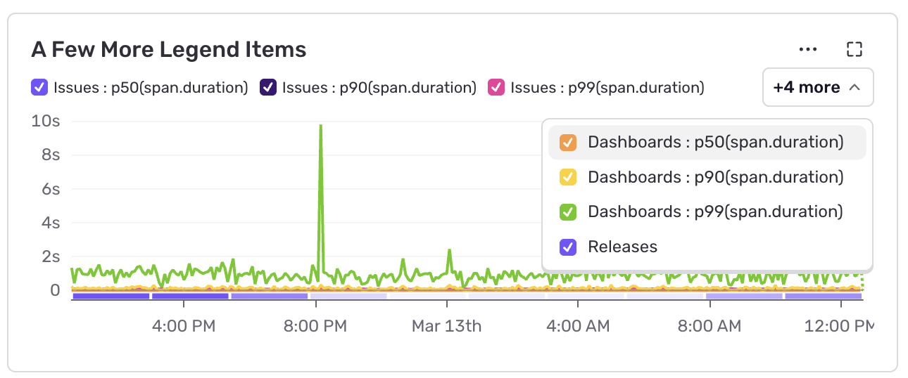
We’ve released improved legends for Sentry’s dashboard widgets. They solve several problems with the old implementation:
- We now show an easy-to-use dropdown when there are more series than fit on the chart – before you had to fiddle with backwards and forward arrows.
- The check boxes representing the series are now actually check boxes – let’s not talk about how this worked before.
- We fixed various rendering and performance problems.
Check out our docs to get started building your own dashboard.